images
There are a lot of media files in this site. They’re mostly artworks, film scans, and screenshots of my projects. This evening, I’d like to share how they’re organised and rendered here.
reels
Image data like their file names, alt texts, and captions are stored in flat-file databases called reels. A basic entry looks like this:
image
  .alt: alt text
  .file: folder/filename.png
  .cap: caption
variants
Images can have variants that could be more suitable in certain contexts. For example, an landscape image can have a portrait variant that would look better on a mobile screen.
For me, I have the following:
- image.jpg
- the default image
- image.webp
- the default image converted to WebP, which tends to be smaller in size (bytes, not dimensions)
- image_400.jpg
- a smaller (this time in dimensions) variant intended cases where loading a higher-resolution image isn't necessary; could also be accompanied by a WebP variant (image_400.webp)
- image_p.jpg
- a portrait-oriented variant, if the image isn't already one
In reels, these do not have to be declared as long as the file names of each variant match the original image’s and has the correct suffix and extension.
picture
Images are generally presented using <figure> and <picture elements. Arachne parses reel data and, based on the availability of the variants, will output something like this:
<figure>
  <picture>
    <source srcset="image_p.jpg" media="(orientation: portrait)">
    <source srcset="image_400.webp" media="(max-width: 30em)" type="image/webp" width="400">
    <source srcset="image_400.jpg" media="(max-width: 30em)" width="400">
    <source srcset="image.webp" type="image/webp" width="800">
    <img decoding="async" loading="lazy" width="800" alt="image.alt" src="image.jpg">
  </picture>
  <figcaption>{image.caption OR image.alt}</figcaption>
</figure>
Note: the order of the <sources> matter as the browser will choose the first one that it can display. Above, with the WebP source, if the browser does not support it, it will use the JPG one instead.
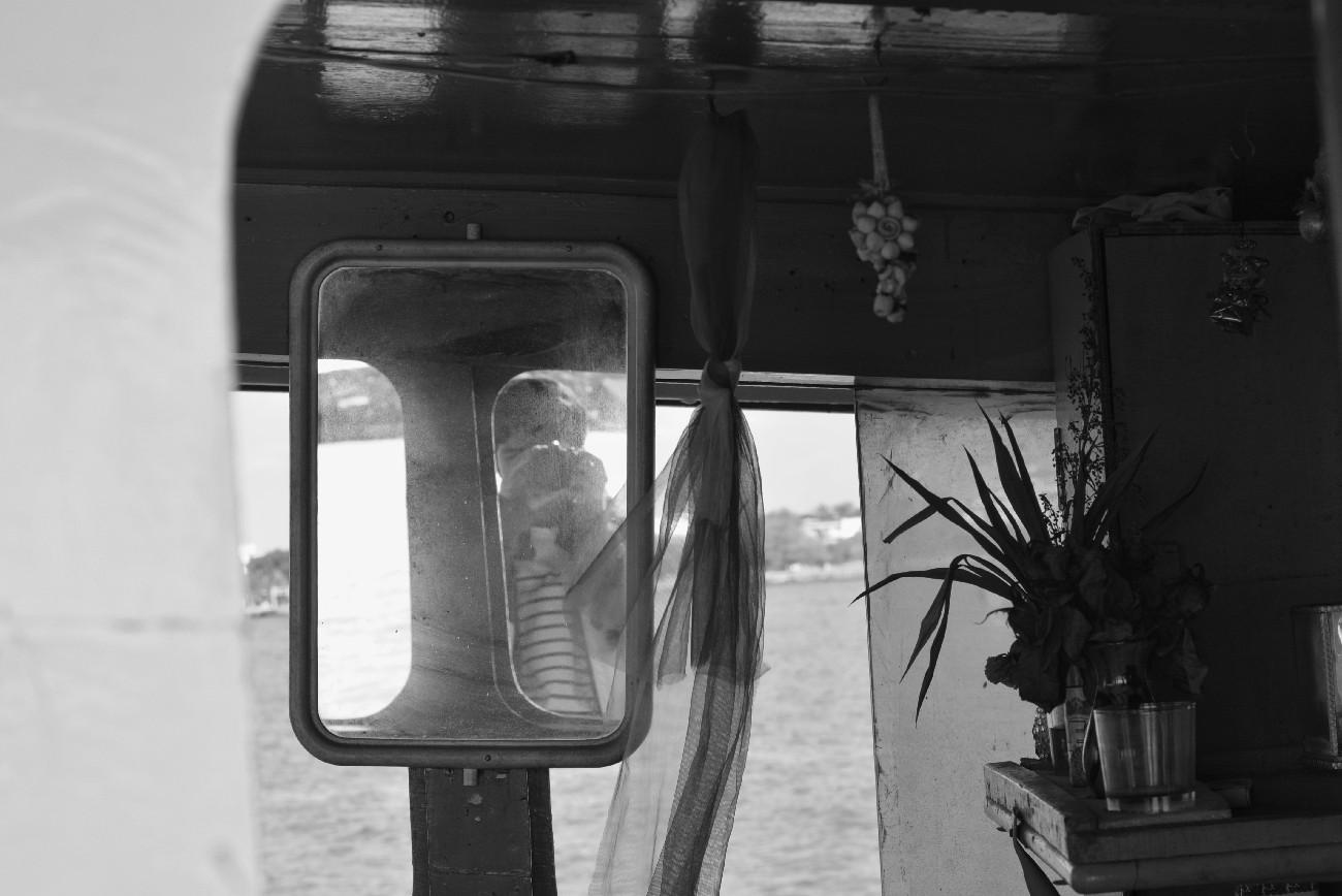
Try resizing your browser and see the image above go from landscape to portrait.
There are other media queries you can use like (prefers-color-scheme: dark) for dark mode variants and (prefers-contrast: more) for high-contrast.
gallery
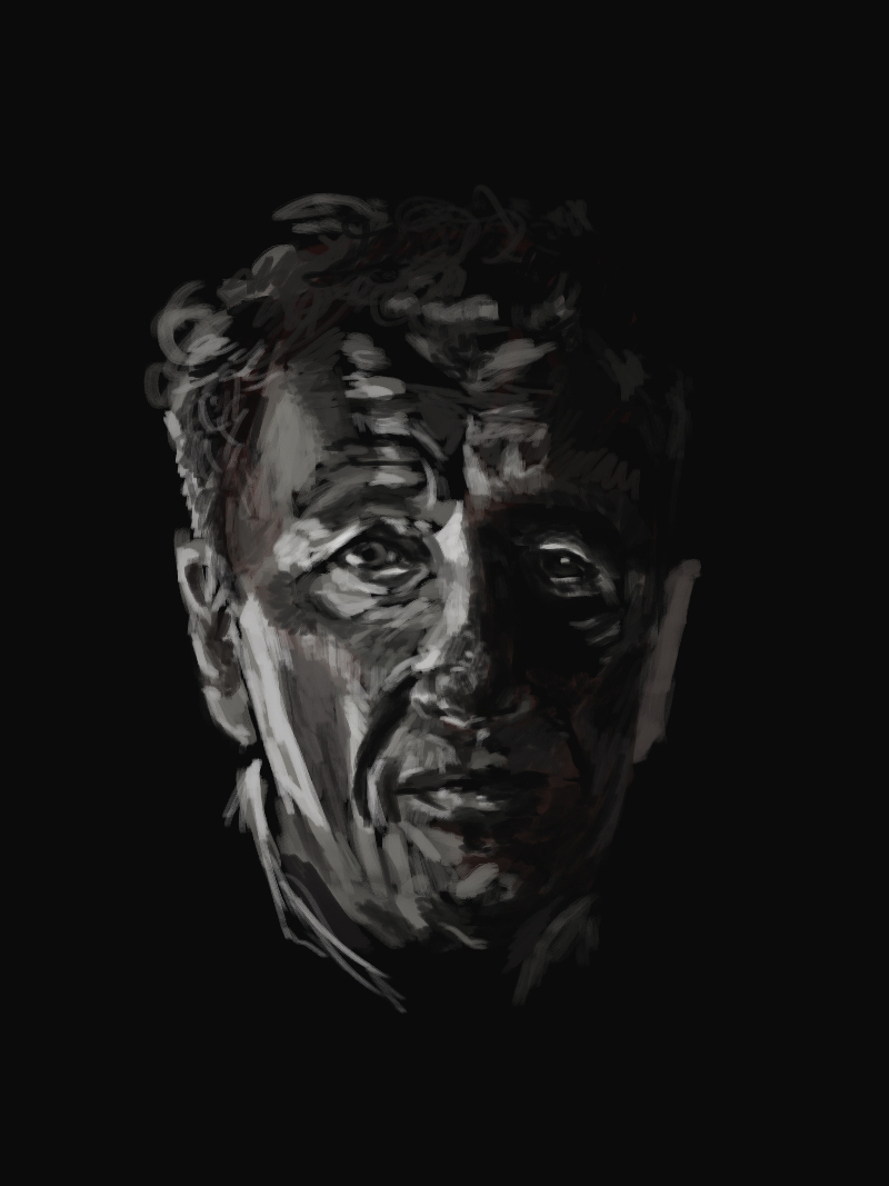
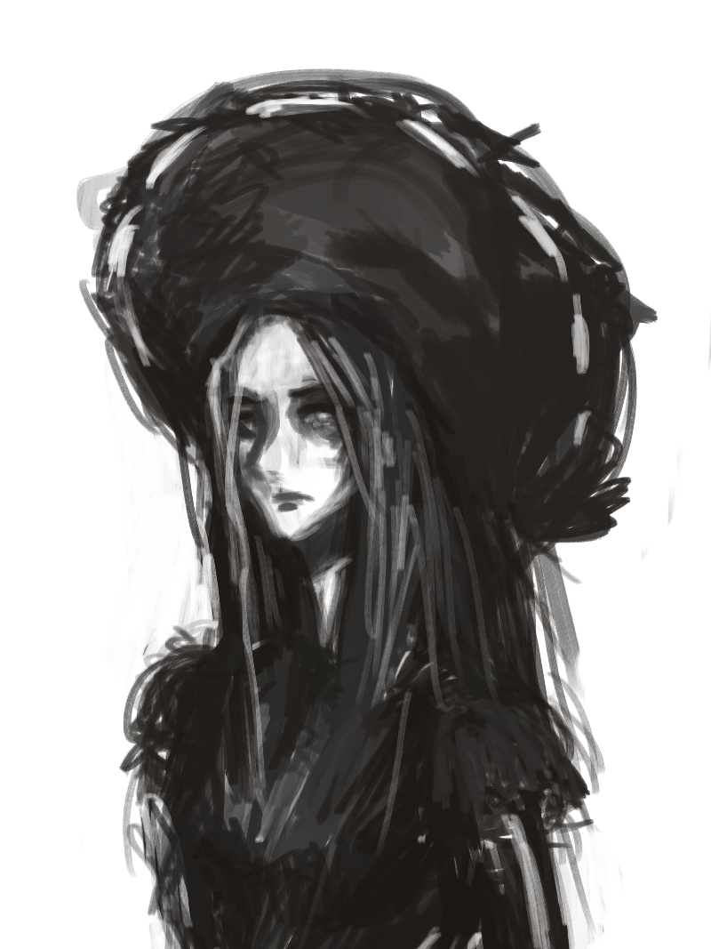
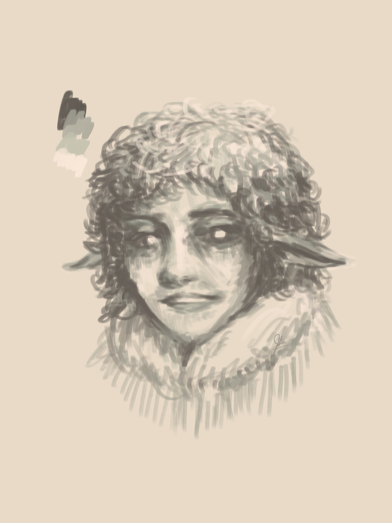
Series of images are usually displayed in a gallery grid, which is actually flexbox. The reason behind it is so that the galleries will look good, or at least fine, in wide displays.
tools
Some tools and commands I use:
| cwebp | WebP converter |
| GIMP | image processing/editing |
| imagemagick | image processing/editing |
| jpegoptim | JPEG compressor |
| mat2 | metadata anonymisation toolkit |
| OptiPNG | PNG compressor |
# resize image to 400 pixels in width (maintains dimensions)
convert image.jpg -resize 400x image_400.jpg

# convert to WebP
cwebp -q 85 -mt image.jpg -o image.webp

# remove metadata
mat2 --inplace image.jpg

# optimise images
optipng image.png
jpegoptim image.jpg
further
The system has been working quite well for the most part, but there are things I’d like to fix/improve and maybe even add.
The gallery grid is one of them. On some days I want masonry (sans some jazzyscript library) but CSS support for it isn’t widely available yet.
Another aspect of the grid I’m still figuring out is that sometimes I want certain photos to take up more than one cell, either row- or column-wise. You can see examples in the pixel art and Drawtober pages where there are images that have this property:
flex-basis:calc(calc(100% / 2) - var(--f3))Dithered images! I used to and still have a few of them around here somewhere. As soon as the CSS feature query for prefers-reduced-data or something similar is available, I’d like to add dithered variants.
I’m also considering adding AVIF variants. However, when I did some tests, the resulting conversions were often larger in size than their WebP counterparts.
Another feature that could be useful would be page weight labels especially for image-heavy pages as a fair warning for visitors with slow or limited bandwidth. But since I’m using variants, it should also reliably show page weights, e.g. 234 kB if you’re on a mobile connection and 510 kB if you’re on a high-speed connection. I’m not sure about this yet.
And lastly, as an artist, I’m looking for ways to circumvent or at least fuck with AI. There’s this tool called Nightshade that "poisons" images. My laptop can’t run it though ;-;
Nightshade is computed as a multi-objective optimization that minimizes visible changes to the original image. While human eyes see a shaded image that is largely unchanged from the original, the AI model sees a dramatically different composition in the image.
— The Glaze Project
How do you manage your site’s image library and display them? :)
— josh