renaissance
This site is 7 years old and has gone through many iterations, from its Jekyll-powered days to a short-lived Squarespace trial to its never-ending redesigns after being liberated from template-/platform-specific restrictions and granted full creative control via transition to a custom static site generator. Something that hasn’t changed is its purpose, which is to be a place to document my projects and one of a handful of tiny places in the grand Internet cosmos that represents me.
Earlier this month, I attempted to write about something every day, or at least every other day—and failed if you look at the date of the last post. Blogging is something I’ve wanted to do for a while but honestly writing isn’t my forte. But anyway as I started posting, I continued refining the site as the content began to reshape the vessel that held it, focusing especially on typography, semantics, and accessibility.
Changes were incremental and pushed quietly and had been going on for a while — on and off since last year, in fact. But I haven’t really talked about them so, in the spirit of writing about something, here’s a post.
a final final redesign
Every time I redesigned the site in the past, I’ve consistently and naively wrote HTML to cater to CSS rather than the other way around, which resulted in rather messy markup. This time it’s different. Here’s what I did and what I would recommend anyone looking to redesign or rebuild their website:
Strip everything down to just plain markup tags. No classes, no styling. Focus on how the information you’re presenting flows vertically. Format things semantically—use the correct headings, use articles and sections, etc. (see HTML § guidelines).
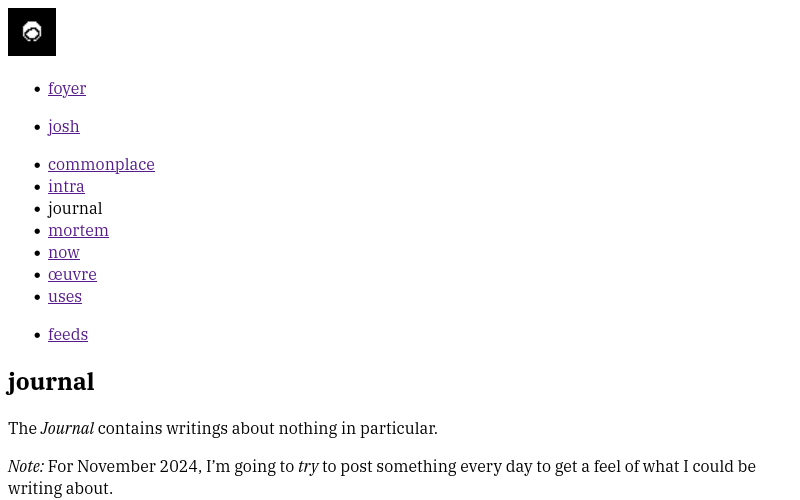
Check accessibility. Properly-structured semantic HTML already has pretty good accessibility but some ARIA might be needed such as in the case of having multiple navigation elements.
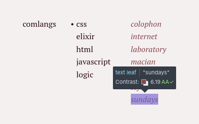
Start adding CSS, keeping accessibility in mind. Play around with layouts, colours, and typography. But make sure text is still legible and at a minimum 16px font size. Watch your colour contrasts too. Something else to keep in mind is to not rely only on colour for visual cues like when hovering over links as an example. If your links have text-decoration:none applied, rather than just changing their colour on hover, you could also have them underlined too for people who may not perceive the colour change.
As a fun* challenge, see how far you can go without modifying your markup, i.e. adding class names and wrapper elements. I tried completely removing classes, opting to instead use modern CSS selectors and custom elements, however, I still ended up with a few classes for unavoidable cases like the pxl class to mark images that needed to have pixelated image rendering.
Make use of feature queries and the @supports at-rule to conditionally add styling, especially if you want to use the latest CSS features that may not yet be supported across most browsers. You can use these to enable or disable animations based on the user’s motion preferences or have a different way of presenting links for users who prefer high contrast.
The following screenshots were taken in Vivaldi. If you open the web developer tools and click on the vertical ellipsis in its top bar, you’ll find the Rendering panel where you can see how your site would look under different CSS settings.
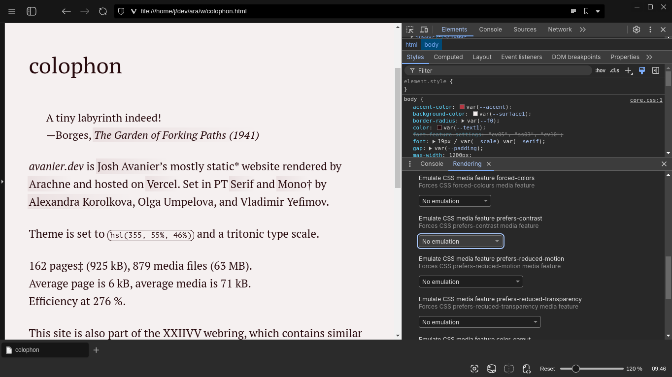
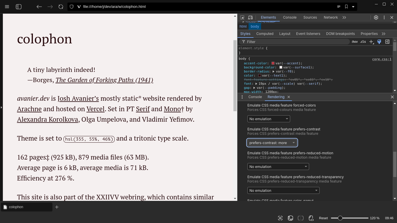
Optional step. Sprinkle in some JS to add improvements to the browsing experience like adding functionality to otherwise non-interactive semantic elements, or fun little easter eggs like snowfall effects for the winter. Again, try to do this without modifying the markup as much as possible. This is to ensure that users who prefer to browse sans scripts would still be able to view your content. But if JS is a necessity, like if the page exists to showcase some demo or needs to be interactive, include a <noscript> element that states the requirement and why it’s needed. Also, be mindful of how much you’re adding to the page load. Stick to web APIs and native features as much as you can. If you’re just going to add a little tooltip, do you really need to include an entire library?
Test on several browsers, even if you’re just a fan of one. At least test on Firefox, Vivaldi or Chromium, and Safari to cover most bases.
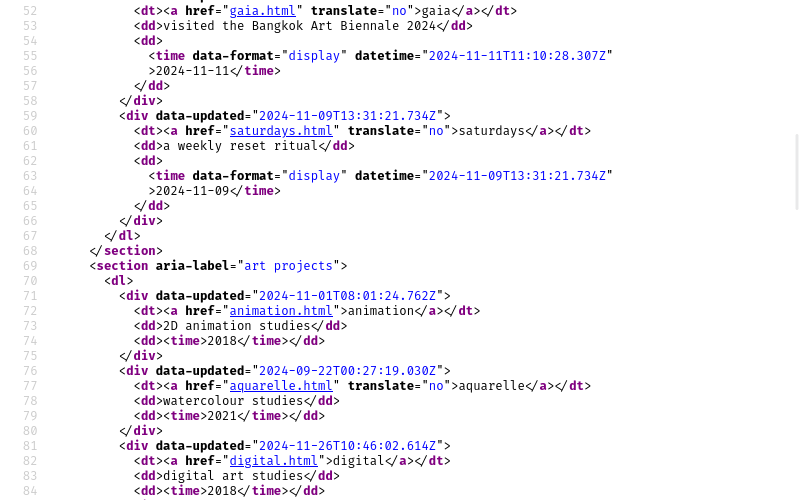
Now my markup is rather pristine. html-validate had nothing to say. Have a look at the source code of this or any other page. I recommend using the browser inspector to see a formatted version instead of viewing page source as Arachne is set to minify HTML. I would also encourage you to try to view this page with and without CSS and JS.
core.css
Something else I did differently here is how I wrote CSS. Everything starts with variables for scales and an accent colour. Font sizes, margins and paddings, and the colour palette are then calculated from those initial values. This isn’t something novel. It’s pretty much just design tokens. But anyway with this system, I can just switch between different scales or use a new accent colour to easily give the site a refresh every now and then without going through another redesign, and harmony is retained (in theory). See the style page for more info.
This is something I’ll apply in my other web things.
little details
What I’m most proud of about this site are the little things that most people may not even notice. I won’t spoil too much but here are a few of them. These are meant to be delights (or bugs, if broken) to be discovered:
See the little details
Images could be displayed accordingly based on your device's screen resolution and orientation. Smaller formats (WebP) are prioritised and shown if your browser supports it. Animated GIFs aren't loaded if you don't like motion. The Noodle page is in black-and-white. Small typographical details. Some easter eggs here and there.
expansions
On top of the usual project pages, there are a few new and old sections of the site that may be of interest.
The Journal is the aforementioned blog. RSS, Atom, and JSON feeds are available. I certainly don’t need all three, but I’ll have them there for now until I figure out what I want/need.
Speaking of now, the Now will now have a feed of its own too. It’ll be updated on a monthly basis so the first entry will be on the .
The Yearbooks have been around for a long time but I don’t think people know they exist. They are yearly activity overviews, compiled from time-tracking logs. These don’t have any feeds.
The Gallery, a very recent addition, is a feed of the 50 most recent images, mainly artworks, that are uploaded on the site. Think of it as a sort of Instagram feed; it uses OpenStories by ddddddddʣzzz†, which I first saw on Mu-An Chiou’s site. Consider this section experimental as it does require JS (sorry‡). Alternatively, I could also just make this into a static gallery page. We’ll see. I just want it to be an option for anyone who may be more interested in my visual output than my other projects or this blog.
Lastly, the Commonplace is where I keep notes on assorted topics. These range from notes on computers and tools to typography and languages. More to come.
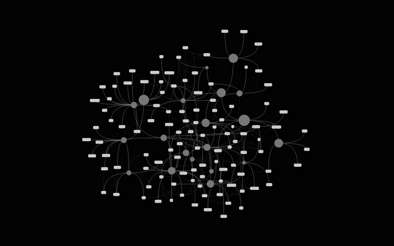
Navigation-wise, I’m still all for one-word URL slugs. Every page has an ancestor that ultimately leads back to the index (foyer), and once in a while, pages could be recategorised under different ancestors like in cases where projects are moved to the Void. So not only is it cute, it also preserves links as they are no matter how much I shuffle pages around—all without the fuss of handling tangly redirects.
At the header, you’ll find navigation similar in structure to the likes of Devine’s XXIIVV, rostiger’s Anchors, and Arcade’s aethopica. A portal is simply a page that is somewhat related to the current page but belongs to another ancestor.
| foyer (home) | ancestor page | current page sibling page | portal page |
I hope this makes the labyrinth easier to traverse. I don’t have any plans to implement search at this time, but you can find a search form§ in the colophon that uses Lieu by
imperfection
While I am confident and satisfied with the current state of the structure of the site enough to publish this post, there is and will always be room for improvement. There are pages to polish, pages to remove, images and alt texts to refine, features to redo, changes to undo, and I have several ideas and experiments regarding interactivity with semantic elements that I’ll be testing later on.‖ I’m also teetering towards possibly adopting microformats, though I’m unsure if it’ll be of benefit for me.
That said, me being me, there’s a chance at least one of the things I mentioned in this post is malfunctioning by the time you read this sentence. So if you encounter any issues, please reach out to me in the Fediverse. I’m especially looking forward to hearing from people who use accessibility features.
This post is a drop in the ocean with many other far more talented groups and individuals making the web a better place for all, but I hope it inspires someone else to head towards that goal too. Shoutout to the folks at Merveilles, individuals like Mu-an Chiou and Thomasorus, studios like Noгma, collectives like the Rabbits and W3C’s Sustainable Web Design, and countless others who have inspired me in various ways over the years and whose influences shaped both this site and me, getting to where we are today, and continue to do so. Check out links § inspiration and the webring below!
Now with Arachne in shipshape, I’ll continue making art, building things, and sharing them here, especially with December just around the corner, bringing with it yet another month-long creative endeavour in the form of The December Adventure. This has been my little renaissance. See you around.
— josh